🎬
Highlights, Camera, Action
Improving the tools that help customers gain and share insights
🎬
Improving the tools that help customers gain and share insights

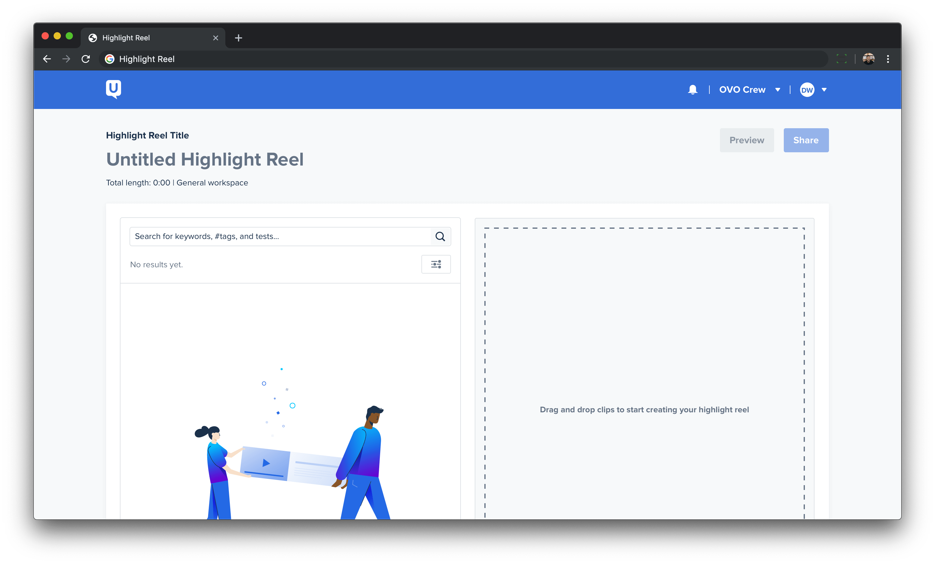
UserTesting’s customers have a need to find and share learnings gathered from research. UserTesting offered an incomplete feature, highlight reels, to help fulfill this need. Highlight reels enabled customers to stitch together clips of valuable insights, allowing them to then share those insights with their teams. The feature had declining usage due to technical challenges and poor user experience. My team was tasked with improving our customer’s engagement and satisfaction with this feature.
Identifying our customers’ need to “find” important insights, we delivered an experience that:
We had no shortage of external and internal feedback on ways to improve the feature. We relied on this feedback paired with customer surveys to understand the unmet needs of the highlight reel. This helped us form a job story and desired outcomes.
Job Story
When I see trends and patterns in customer videos, I want to be able to share key insights, so I can prove decisions to stakeholders.
Desired Outcomes
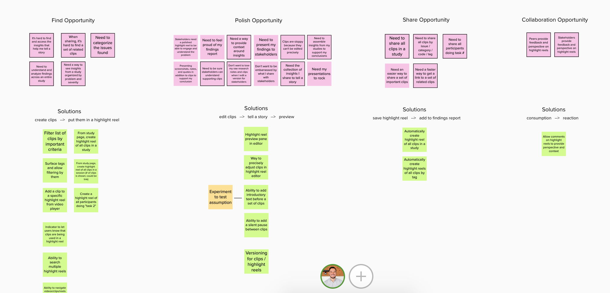
As a squad, we used this job story to develop an opportunity solution tree using Mural. Based on feedback and the needs of the business we decided to focus on the "find opportunity".
Find Opportunity
Customers have a challenging time identifying, sorting, and selecting clips in the highlight reel.
We developed three key metrics that would help us determine our progress in solving this opportunity:
Once we had a clear opportunity and possible solutions, it was time to experiment. I worked with our design manager, Scott Johnsen, to craft a vision—a further out solution—to solve this opportunity. We transferred this vision to a high fidelity prototype to get early feedback from customers and prospects. We ran unmoderated and moderated interviews testing concepts and patterns. This process gave us confidence that we were solving the right problem with the right solutions.
Iteration
What I love about UserTesting is how easy it is to put something in front of another human, customer, prospect, etc. This makes getting quick feedback incredibly easy and cheap. Anthony and I came up with assumptions and hypotheses around specific elements and entire flows. I transferred those questions to pixels, and we got to experimenting. We broke this vision down into deliverable pieces, which we made sure to always tie back to customer value. This allowed us to look down-range while also building to get there.
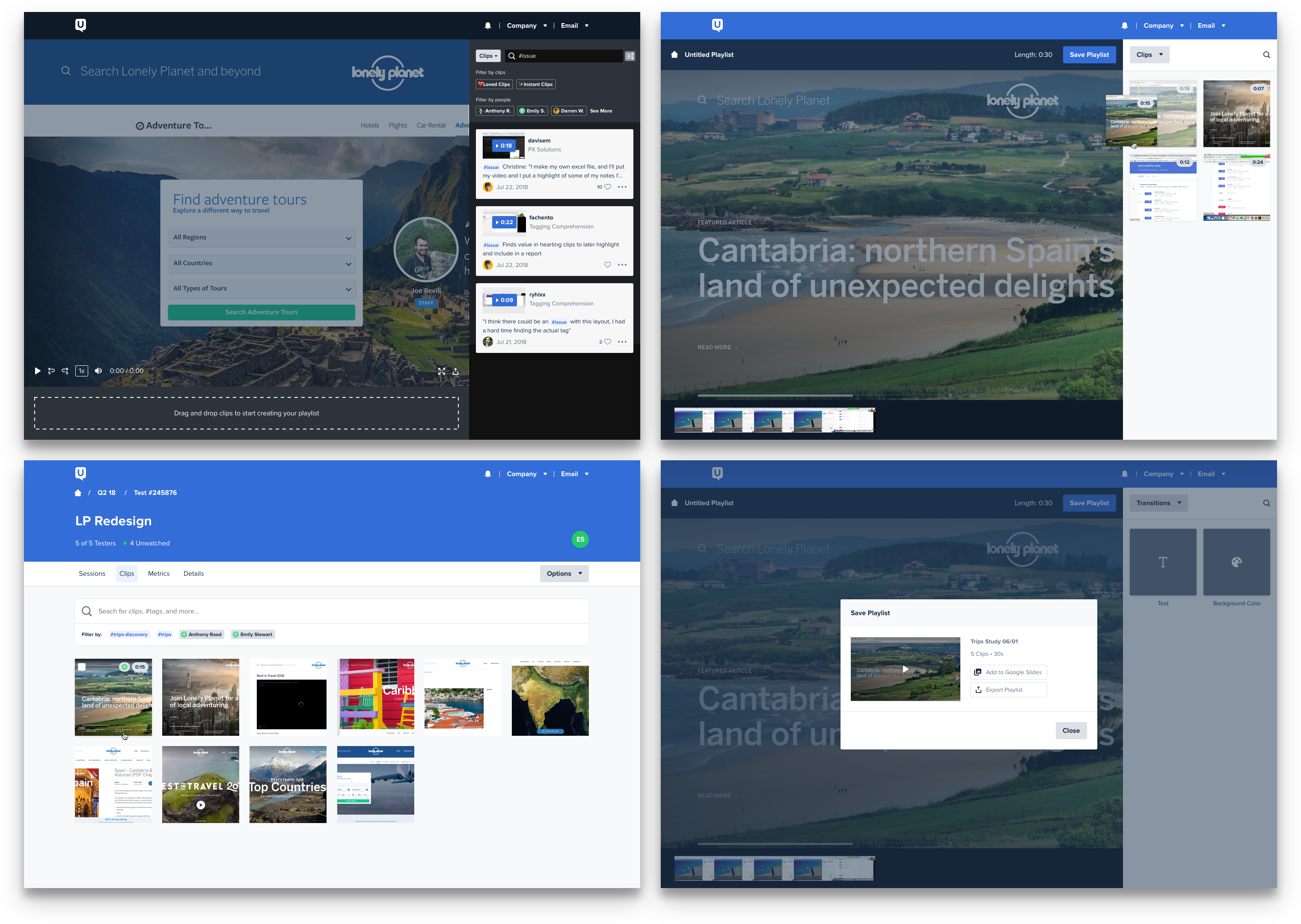
Based on our learnings from the experiments and our key metrics we came up with some solutions to solve the “find opportunity".
⚡️ Instant Highlight Reels
UserTesting hosts a PanDE week, a hack-a-thon of sorts, bringing everyone from product, design, and engineering together in San Francisco. The theme of the week: Experiment. Teams were encouraged to validate ideas creatively, cheaply, and quickly through experiments. Since we were deep in thought on the highlight reel we decided to focus our efforts on that.
Our customers prefer not to watch their entire videos. After all, they are using our product to get insights not to watch videos. What if we could find a way to fast track them to those insights?
Through some coding wizardry, we added a button to the product that instantly created a highlight reel based on a task. We quietly launched it during PanDE week, and in a month we had 150 unique customers actively using the new feature. In six months, we saw a 350% increase (675 customers) using the feature. This was a great lesson in truly understanding the problem and using quick experiments to gain confidence.
🏷 Tags
Still reeling from PanDE week, we focused all efforts on our tagging feature. Our product was always built by and for researchers. This led to amazing innovation in capturing feedback. This also led to very research-specific ways of capturing feedback. Our product had the capability for tagging using words written in [brackets]. The only place a customer could see a bracket tag was if she exported her test to an Excel file. There was a need to surface these tags in-app.
Tagging is not a new idea, heck it wasn’t even new to UserTesting. We wanted to be smart and not reinvent the tag on this one. We started by documenting specific behavior, as well as examples of tags in the wild. By staying consistent with common patterns and releasing value as it was ready, we were able to get tagging out quickly. This enabled customers to start using it providing us coverage for our next solutions: search and filters.
🔍 Search and Filters
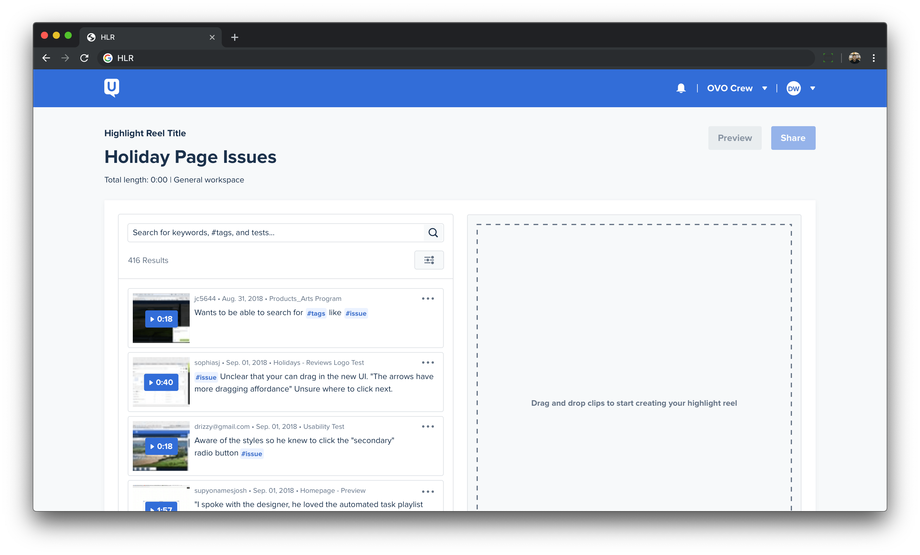
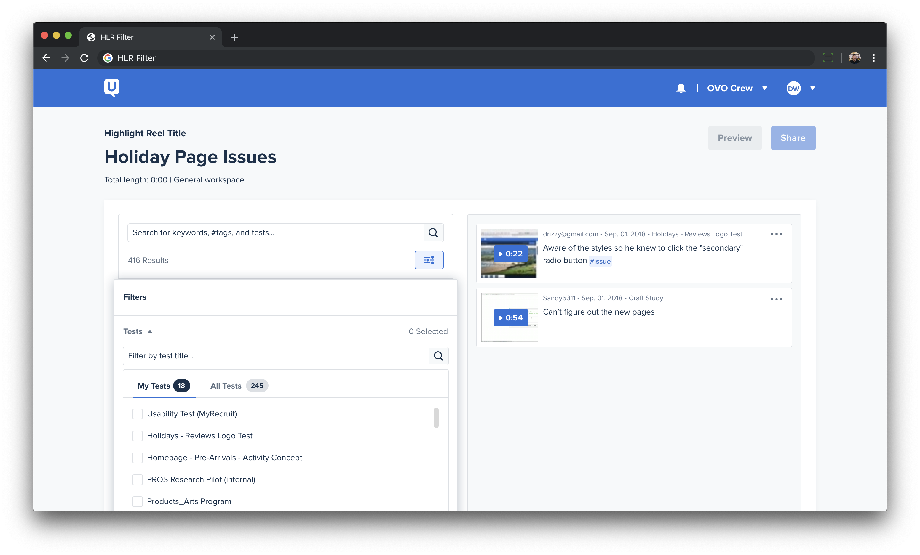
This was the piece that brought everything together. This enabled customers to broadly search and narrowly filter a list of clips to find exactly what they were looking for. We also implemented auto-complete for tags to help assist customers when trying to remember a tag. With the improved clip content, they could search for tester names, notes, and the test they came from. If customers knew exactly where they wanted to look for clips, they could use the test filter. This helped them pinpoint the exact test or tests that contained their insights.
Develop new functionality for customer to solve the “find opportunity"
We implemented tags, search, and filter to aide our customers in identifying, sorting, and selecting clips in the highlight reel. In the three months after we released tags, our customers created 11,000 unique tags. We averaged about 500 searches per week.
Improving customer satisfaction with the highlight reel editor
We sent out surveys before, during, and after releasing the improvements above and we improved our satisfaction by forty-four percent. Many customers commented on the enhanced clip design and dragging/dropping functionality as the reason for their positive feedback.
Increasing the number of highlight reels created
At the start of this initiative, we were seeing around 300 highlight reels created per month. Post-launch we saw that number skyrocket to 1,000, an increase of ~200%. Over fifty percent of the total highlight reels created were attributed to instant highlight reels. About seventy percent of customers who created a highlight reel came back to create a second one.
“Love the tagging feature -- I now actually make [highlight] reels.”
Researcher @ Square
“Thanks for adding hashtags...makes it a lot easier to find items.”
Researcher @ Healthwise
Always be experimenting
The theme for our PanDE week was around experimentation. We were empowered to choose a problem, write a hypothesis, track how we would validate or invalidate the experiment, and map out the appropriate next steps. This gave us a light weight way to test out ideas that treated failure as just another step in the process. This environment gave the team the confidence and space to develop the instant highlight reel feature. We had all the necessary pieces right in front of us and using the experiment lens helped us see the bigger picture.
Understand the problem and the solution will come
Anthony Raad, a staff UX researcher was instrumental in the success of this project. He gave us a look inside the mind of our customers through filtered feedback and interviews. By the time we exited the understand phase we knew the key features that would improve the experience for a lot of our customers. Brian, our fearless PM, led the charge on defining and scoping this opportunity to ensure we were focusing on solving the right things. By the time it came to put pixels on the screen our solution so solid that it had customers asking, “when can I have this?” Working in this way made it incredibly easy for me to always map everything back to customer value.
Show your work
Our company is founded on the philosophy that getting feedback will make your product better. Feedback can come from anywhere and it was important for us to filter that feedback, especially internal feedback. We got a pretty strong signal from our early surveys and interviews that were were some unmet needs in the highlight reel. In a priority planning meeting a key stakeholder wasn’t so sure there was enough of a need here. The proposed solve was to do the bare minimum and move on to other pressing projects. These conversations are always challenging, when comparing a few top-level items how does a company choose where to invest time and money? However, as a team we felt this was an important initiative. We built our case around why we should make this investment and why we should make it now. We used the product as our customers do and presented clips of our interviews in the next planning meeting. Seeing the frustrated looks as our customers used the existing product and the hopefulness of their voice as they used our proposed vision was enough to convince that stakeholder that this was worth building.