📍
Connecting the Dots
Building a system of elements and components that power UserTesting
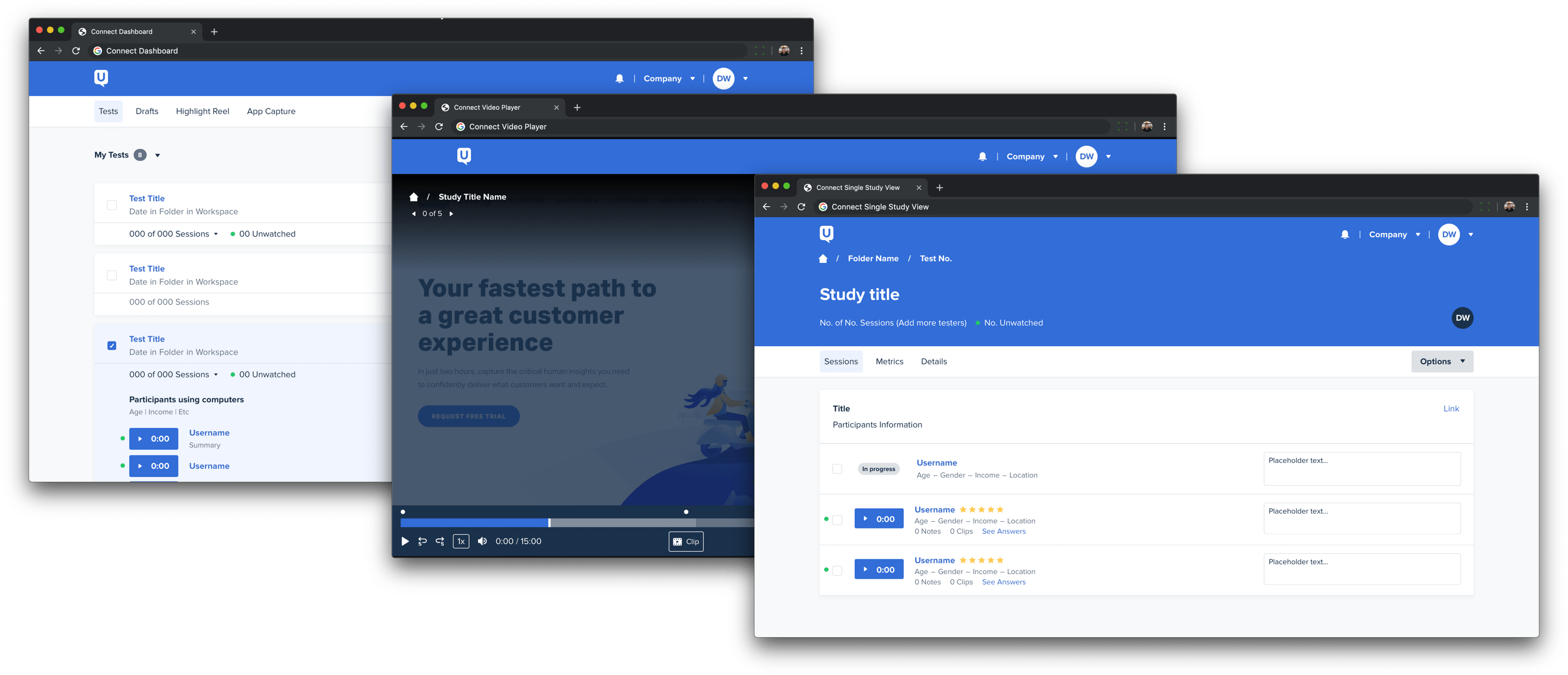
📍
Building a system of elements and components that power UserTesting

UserTesting — founded in 2007 — has always been focused on helping companies create great experiences. For over a decade, UserTesting has been the market leader in usability testing and the de facto tool for researchers around the world. Though much has changed in the past 10+ years, the look and feel of the core application has remained the same.
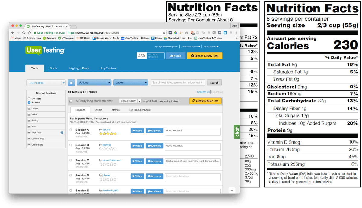
I vividly recall Senior Vice President of Product and Engineering, Mark Towfiq, presenting customer feedback where a customer was praising the product’s capabilities but also describing its design, “like reading the nutritional label on the back of a box of cereal.”
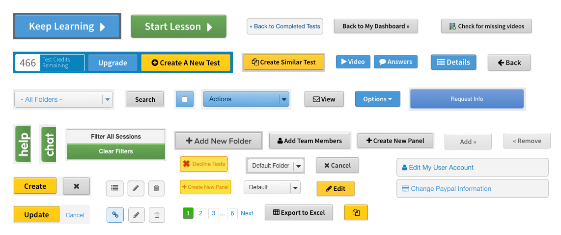
The breaking point for UserTesting was the color-filled rectangles known as buttons. These mismatched and frail collection of items illuminated our inconsistency throughout the product.
Besides, what would a case study about design systems be without a “before” button grid?
As the company continued to grow and expand its offerings, the product began to fray a bit. Primary actions changed style and location from page to page, increasing the time it took for our customers to complete tasks. Internally, without a baseline set of elements, our design team had to recreate elements and patterns from scratch that looked ever so slightly different from what was on the live application.
Our engineering teams, who were building from disparate mocks, created many patterns from scratch which led to confusion, frustration, and inevitably longer build times. Since UserTesting was positioning itself as a premier tool for researchers at a premium price, we needed our experience to match and exceed the expectations of such a tool.
To enable UserTesting's teams to build great experiences, we delivered:
Emily and I started on this project part time, slowly building a team of like-minded passionate people to support this effort. From beginning to end, it took us a little over a year (Q4 2016 to Q1 2018) to ship out a fully integrated design system.
We spent some time negotiating and convincing stakeholders to support this initiative. I wrote about that process in detail here: Starting Connect. The main points that helped us get alignment were that the design system would:
After many slack messages, meetings, presentations, and conversations, we got buy-in from our executive team that a design system was needed to move the product forward.
Audit
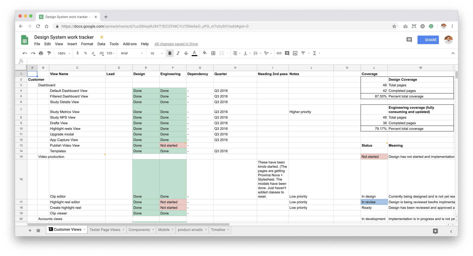
We created a spreadsheet to document the pages within the app. This spreadsheet had two main columns: design and engineering. The design column was to track whether we had the sketch counterpart for the component used on the site. The engineering column was to track if that page had been added to the global style guide we created called "the toolkit".
We audited our product which included buttons, colors, type-styles, you name it, we collected it, filed it, and moved on to the next element. This gave us visibility of problem areas and the ability to combine similar patterns. This also gave the management hard numbers to track progress. Visibility = trust.
Transcribe
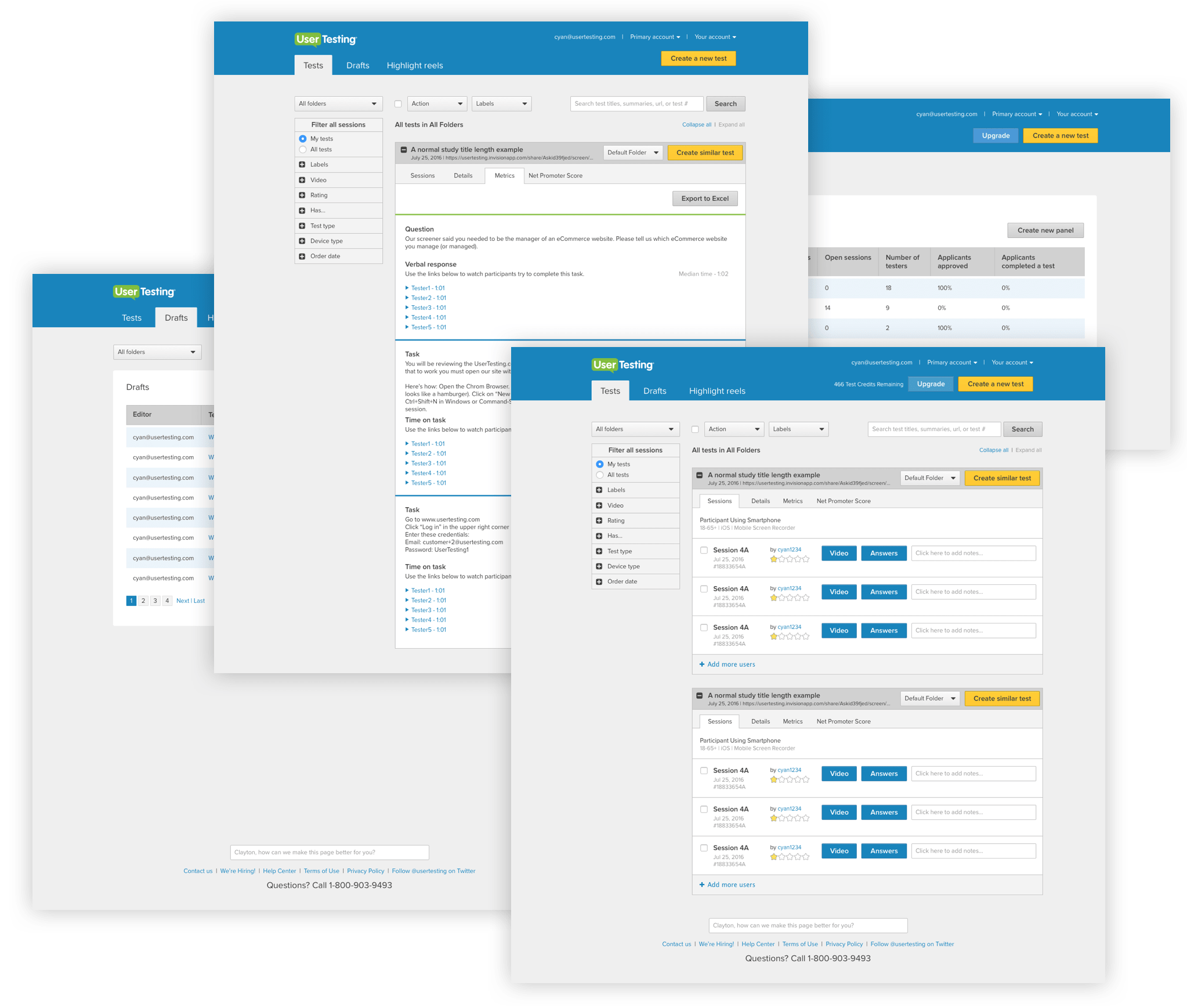
In 2016, UserTesting consisted of four major views: Dashboard, Drafts, Highlight Reel, Video Player. I took screenshots of each view in its existing state and recreated it in Sketch, beginning the consolidation of our product. It wasn’t pretty, but it gave us a solid baseline to build from.
As a new designer to the team, this was a great way to see the entire product screen by screen, button by button, and pixel by pixel. After my tour here, I had a better understanding of the product, where we needed to focus, and where we needed to make trade-offs.
Research and Validation
We worked with our amazing Product Insights (now User Science) team to get really specific feedback early on about on granular functionality and styles. Anthony—Staff Researcher—and I tested everything from the change in content and removal of icons to a brand new experience for our video player. Nothing was too big or too small, and we got pretty good at this. The styles that worked well got absorbed by the design system. The ones that didn’t work well were rethought. It was quick and fast-paced, but it gave us the ability to provide comfort for our stakeholders that structure changes were tried and true. Additionally, it gave us stronger components to put in to our design system. We were able to rapidly test risky assumptions and move forward with decisions that were backed by qualitative data. Moreover, the patterns and components going into the design system were verified, which gave designers and developers confidence while building new products and features.
UserTesting's Director of Research, Marieke McCloskey, wrote about this process in more depth here: Democratizing CX research
Accessibility
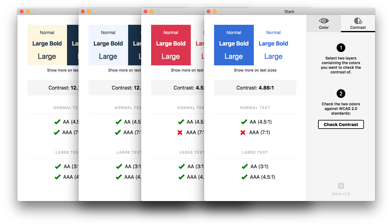
When we started Connect, accessibility was a part of the very early conversations. Emily had been making sure our product adhered to accessibility guidelines long before I joined. Developing the color palette for Connect was my first foray into one tiny facet of accessibility design and I relied on Emily, Homer (engineer), and Mike (engineer) as well as tools like Stark to ensure our design decisions were accessible for all.
Emily helped to keep our focus on making sure our product can be accessed by anyone. It’s easy to get caught up in trying to hit a contrast number and miss the point of why you’re doing it in the first place.
Developer Kit
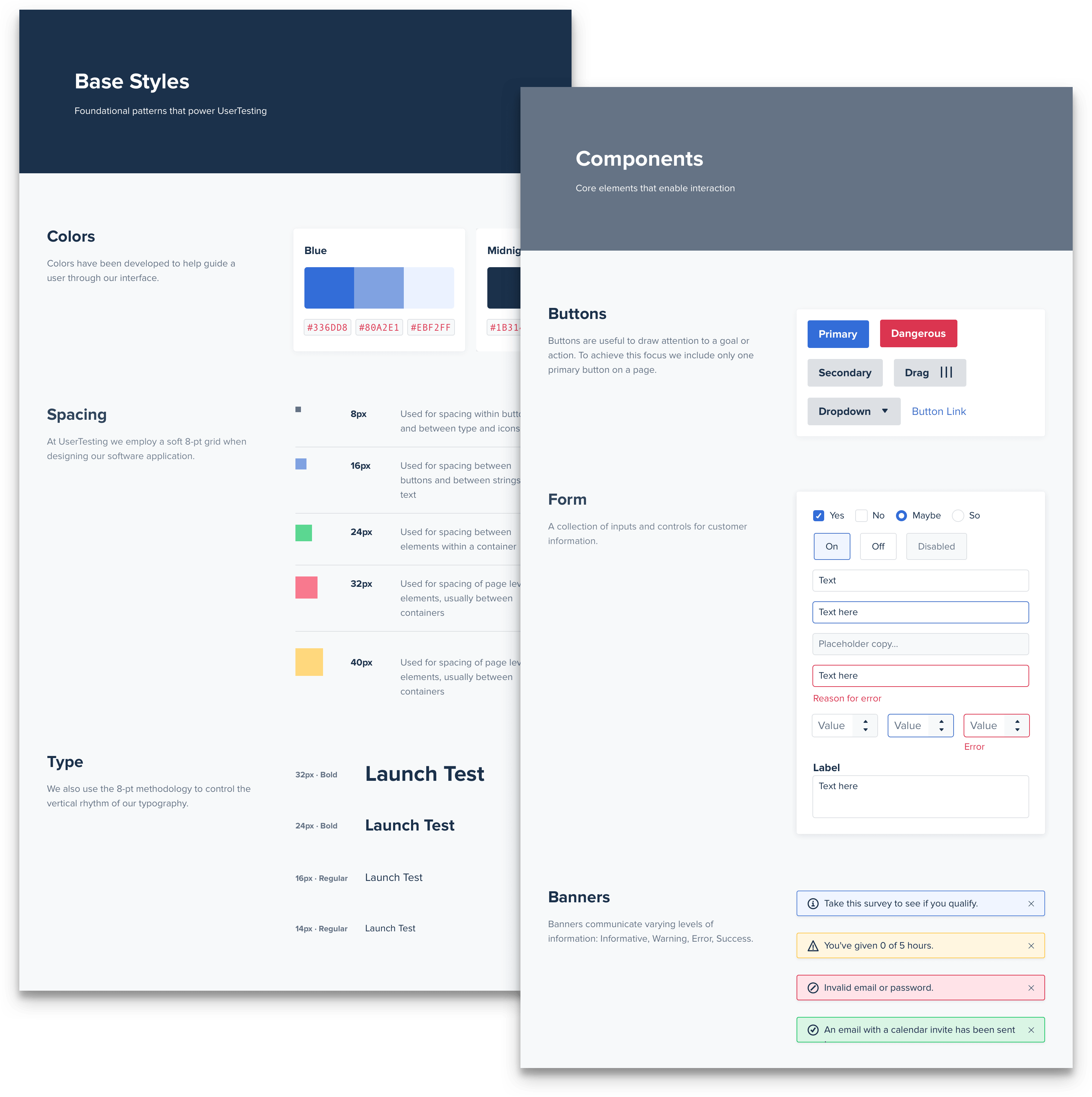
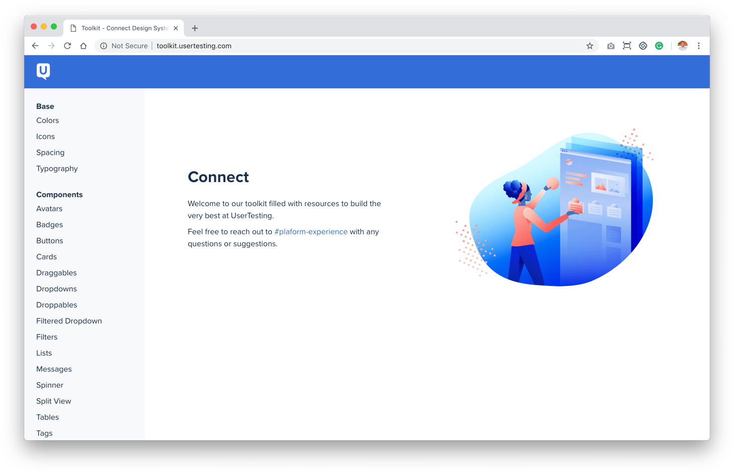
Emily built the first version of our toolkit (toolkit.usertesting.com), a website containing every component in our product along with code snippets. The toolkit also contained style guide direction, our use of BEM, and the architecture of SASS files in our product. I then redesigned the toolkit to provide more structure to the content. In this redesign, I meticulously documented each of the patterns complete with learnings from our research. I felt this was most important to provide our internal teams with the why behind the decisions we’ve made.
Design Kit
We built a Sketch Library that contains each element, component, and page necessary to build the UserTesting of today and plan for the UserTesting of tomorrow. Here are some of my key learnings from building out this sketch kit.
🎯 Focus on value
Having worked on the design system, I had a unique opportunity to build the thing that I used. However, it was easy to get lost in the symbols, nesting, and plug-ins and forget that you aren’t building the world’s most scalable text input. You are allowing your designers to move rapidly to get ideas into prototypes and prototypes to code. This static mock they build is a short-lived artifact, and your design system must accommodate this fleeting moment.
🛠 Break to build
One fear I had while building the system was: what if I spent all this time building out these perfect symbols only to find the designers detaching from them thus rendering the linking of all components useless?! I had to remind myself of the value this Design Kit provides. This scenario is what happens today, and I encourage designers to detach when they need to and follow up with them afterward. Is it because the override panel on the right is too confusing? Is it because it was faster to make a change by detaching? Your system shouldn’t change workflow, it should enhance it.
🗣 Talk to your users (designers)
At UserTesting we care a lot about… erm, user testing. I used this as an opportunity to talk to the designers while building out the system. I used UserTesting to recruit the designers for a usability test of the Sketch kit. I watched how they used Sketch and the library today. I listened to what they felt was missing from the system. Keeping this close line of communication also built trust within the team.
🗂 Get organized
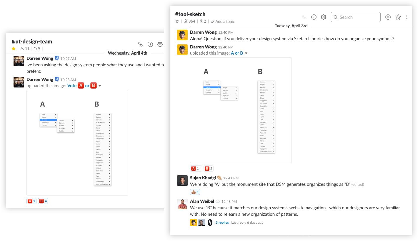
A good Sketch Library is organized. A great Sketch Library is organized based on the people that use it. Too much organization and things become challenging to find. Too little organization and your components become unruly, thus becoming challenging to find. There’s a sweet spot and it comes by talking with your designers to figure out what works for your team.
An example of this was gathering feedback on symbol organization in Sketch. I asked teams externally in the Design System Slack group what they preferred and compared that to my teams’ preference. Based on both pieces of feedback, I started to implement a structure that maps closely to the organization of our developer kit, thus encouraging a shared language between designers and engineers.
🔁 Communicate changes
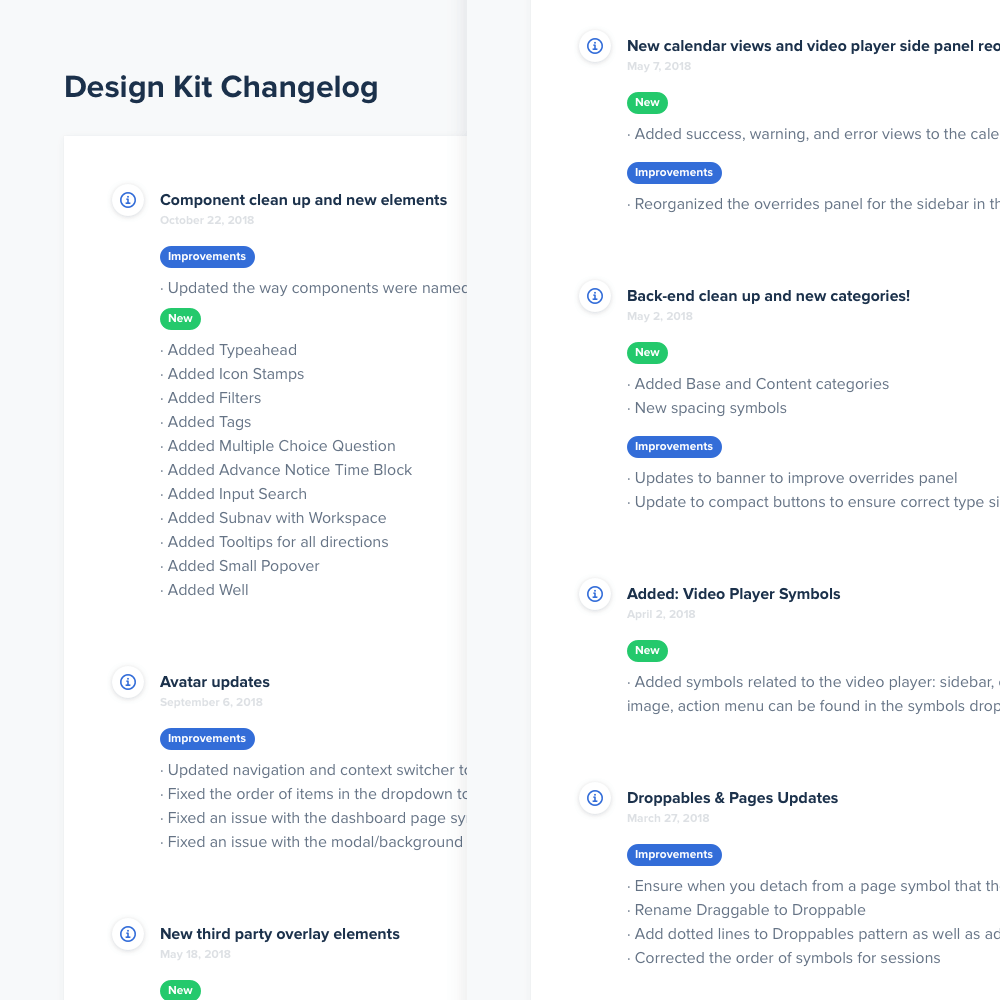
We have one central Sketch Library in a shared folder in Dropbox. The designers have read-only access to this file and the design system team has to write-access to this file. The great thing about Sketch Libraries is a change to the root file will cascade across all files. We have a review every Tuesday and Friday where I announce the change-log to the team and they provide feedback on symbol issues or suggestions on new components.
👩🏫 Instructions and On-boarding
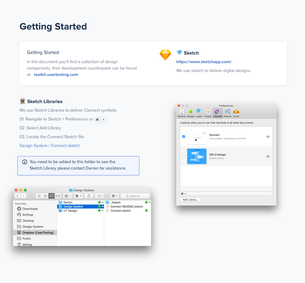
We also created a Connect Readme for anyone who uses Sketch to create digital designs of our products—showing them how to link to our library, what plug-ins to use, and what components exist. Eventually, we will be folding this into our new documentation website. This is a useful tool to get new designers up to speed and for current designers to refer to. I also had training sessions with product and engineering partners to help them get set up with Connect. Everyone is a designer.
📸 SnapUT
Another crucial part of delivering this new design system was a dedicated QA member on our team (shoutout Zack!). He helped maintain an internal visual regression product called SnapUT (we forked this tool https://github.com/wearefriday/spectre) to help catch visual changes before they went out. There will be times you’ll need to remove unused code and the acceptance criteria is “No visual regressions.” Having a tool like this enabled us to release with a higher level of confidence.
This workflow was specifically important to Connect because we were having to manage two UIs against five browsers. This not only sped up his workflow but ensured a high level of quality was met when launching Connect.
100% adoption of design system throughout company
We did an excellent job at getting buy-in early and made sure to keep the department updated throughout the process. Our kits helped us educate the people who would be responsible for designing and developing product to be efficient with Connect.
Another reason for this success was Emily's willingness to help her fellow engineers troubleshoot potential problems when applying Connect. Her responsiveness built trust with the department and her implementation of Connect removed any barriers to entry. I was so lucky to have her as a partner on this project.
Shifting a company's mindset
I think the biggest reward for me was seeing the way Connect began to change how people spoke about building product. It was slow at first but soon everyone from product to engineering began calling things out that didn't align with Connect or offering suggestions of ways teams had solved a similar problem with Connect. This single source of truth that Connect provided not only ensured consistency across the app but allowed teams to think more critically of entire flows and the ways everything was connected.
UX Dust™
UX Dust™ happens when customers have a strong association with a bad pattern. For example, we give our users the ability to make a highlight reel (collection of clips) of their user feedback. It allows for easy sharing of key insights. Our current pattern uses two vertical panels folder to drag clips from one side to the other. Because of its vertical nature, this pattern requires a lot of scrolling to access clips.
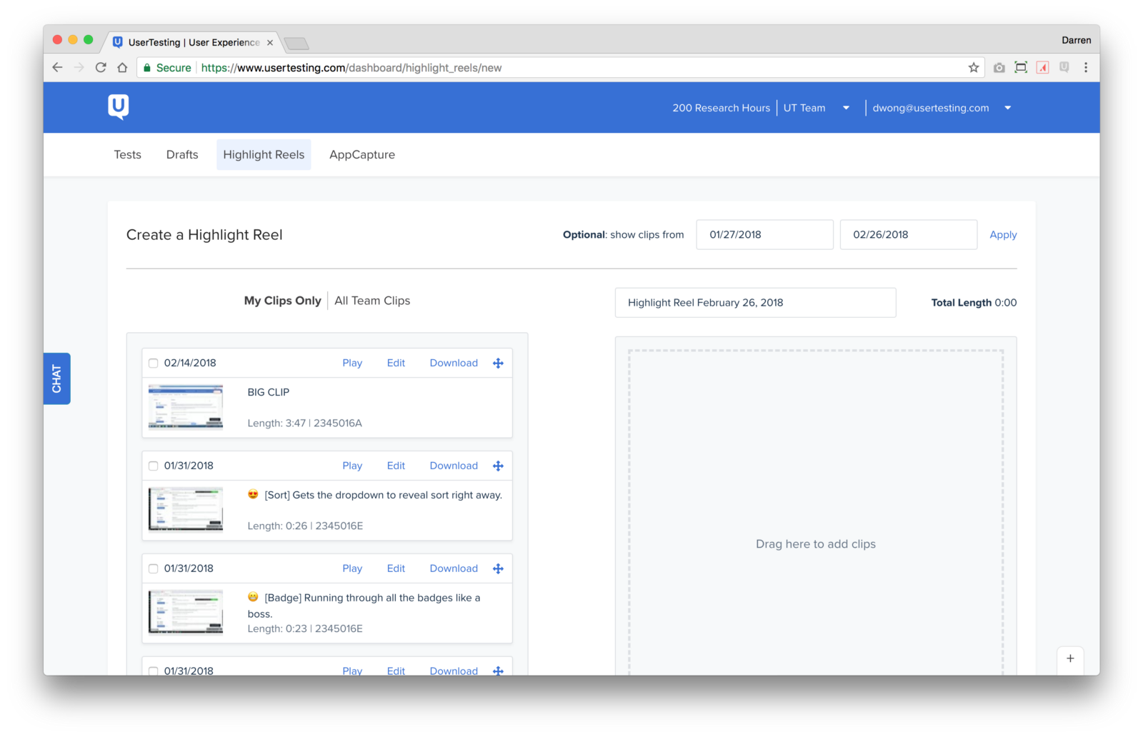
For the design system we decided to implement an 8-pt grid to ensure consistent spacing across the app. This spacing caused our users to see 3 clips in their left pane rather than the usual 3.5 clips. We began to hear the about the pain this caused our customers because of the extra scroll to see more clips.
We kicked up some UX Dust™ here.
This visual change highlighted how difficult it was to use this feature successfully and so the visual change was associated with the UX pain. We were able to get a quick fix out to decrease the customer pain but we know we didn’t completely solve the issue. We put a pin in this experience as an area to revisit. We solved this issue and more when we redesigned the highlight reel experience, read more in Highlights, Camera, Action.
Subjective Feedback
At UserTesting, we think we provide the most value when our customers are testing ideas, prototypes, and products early and often. However, there is one type of feedback that isn’t always constructive: subjective feedback. In our early concept phase of Connect there was this notion from our executives that our product should pass the squint test.
Squint test: the ability to recognize a product even when squinting while looking at the screen.
This manifested as a “hot” color to contrast the cool blues in our product. We arrived at a gorgeous rose quartz, #FA55A2. For the first few months, there was peace. But as we started to use the rose color in more internal facing materials we started to hear murmurs in the dark of the night. Then we got an email with the 5 words heard round the world: Why is this button still pink?
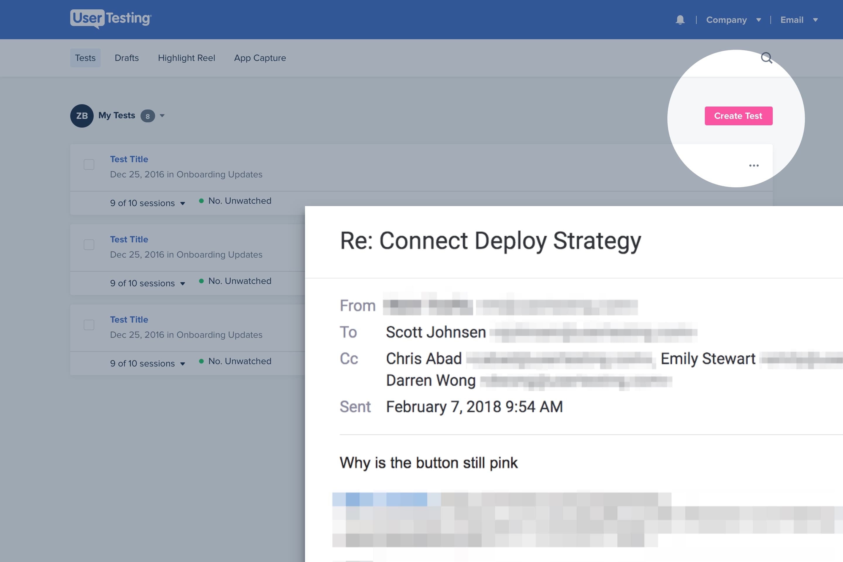
We had a difficult time validating the effect of the pink color on our users. In our usability tests on pages like the dashboard, users were able to accomplish the task no matter the color of the button. Our use of pink fell apart in three ways:
🗺 Context
We didn’t have a compelling story for the rose other than it contrasted well with our other colors. A primary color usually has roots in your primary brand color, this wasn’t the case for our selection. This disconnect became more apparent the more we stress tested the color in different views and pages.
👪 Family
The rose color didn’t family well with our secondary color: blue. Pairing the two together resulted in a cotton candy theme, that juvenile palette didn’t sit well with our stakeholders who wanted to take our product to the enterprise market.
💖 Accessible
We had put all this work in to ensure our colors met or exceeded the contrast ratio set by WCAG. White text on the rose color just would not pass. We attempted a gamut of explorations: darken, shadow, reverse, to no avail. This led us to revisit our primary CTA and it led us to something that was in our faces all along: blue.
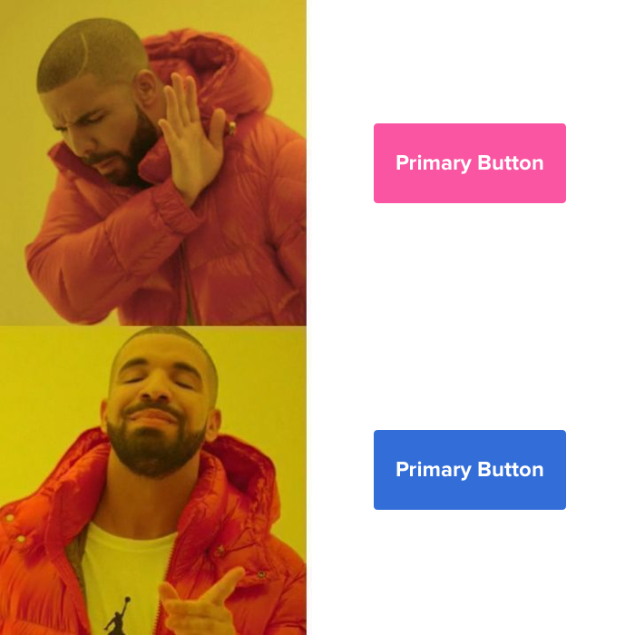
This has a direct connection to our brand color, it worked well with our family of grays — since the grays are derived from a similar hue, and it was accessible to boot. Sometimes you need to take a good hard look in the mirror and other times you need a little nudge to see things clearer. We think our team and our product are better off for it.
Good intentions, bad execution
Early on in developing Connect we thought it would be a good idea to have an internal switch that would allow an employee to see what was happening under the hood. Our expectation of this switch was that it would give our internal stakeholders some ownership in offering suggestions and it felt like they had a pulse on the product.
We we're wrong
This project failed for a number of reasons but the major reason was a lack of communication. It was not accurately communicated to our customer-facing teams that there was a difference between the current UI and the in-flight UI. This lead to customer interactions where they were referencing the in-flight UI. It was a bad experience on all sides. We turned off the switch and continued to tinker with it on our separate staging site.
About two weeks until launch we were ready to try this again. We took our learnings from the last time and were a lot further along in the build phase which gave us the confidence to launch this out to the company. We turned it on Wednesday afternoon… and heard the thing you want to hear when launching a new visual design system: nothing. No complaints and a few excited customers. The biggest learning here was to over-communicate especially internally (and to be forgiving if you make a few missteps along the way.)